Contrary to Popular Belief
by The Curious Pancake
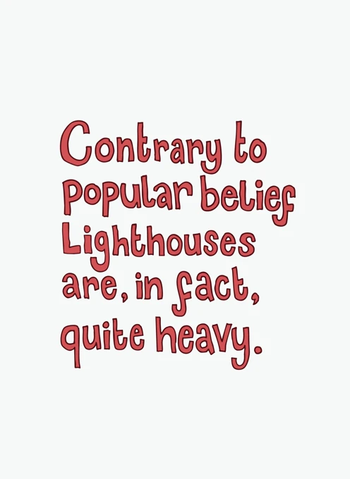
A playful typographic design featuring the phrase "Contrary to popular belief lighthouses are, in fact, quite heavy." The text is arranged in a whimsical, hand-drawn style with bold red lettering on a clean white background, giving the piece a light-hearted and contemporary feel.
Its simple layout and humorous message make it ideal for anyone who appreciates witty wordplay or enjoys nautical-themed sentiments with a comic twist. The overall look is minimal yet expressive, with the typography taking centre stage.
Comparison price excludes free shipping to the US, UK, Canada, Australia and most of Europe.
Price includes
- Free postage within Australia, Canada, the UK, US & most of Europe.
- A real stamp affixed to a beautiful kraft envelope.
- The recipient's address written in the same style as the writing in your card.
Card Details
- Card size: 125 x 175mm / 5 x 7″
- Printed on environmentally friendly 320gsm, uncoated card stock.
- Stock may vary by region and availability.
About the Artist
The Curious Pancake
Claire Senior
I've been drawing weirdness with pencils and crayons since the days of Tony Hart - only really old people will get this reference. After graduating from Loughborough University in 2000 (see the 'old' part) with a first-class degree in illustration, I did what every creative does and went straight into minimum-wage retail work. I worked in lots of greeting card shops, and the designs on the cards inspired me to create a humorous and contemporary collection of designs, specifically for the people who don't want to see 100 identical capybara cards, and also for those who are physically sick at the thought of puns.
I've been creating weird cards since 2017, and there's still no stopping me. I live in Nottingham with my partner, Ben, and our three cats, Edna, Ozzy, and Olive. I love eating and not leaving the house. Through grit, talent, and dogged determination, I went from earning the minimum-wage to earning half the minimum wage in 12 years. I'm hoping my inspirational story might help steer someone from illustration to, I dunno, maybe plumbing?