Better Than a Month Late - Funny Birthday
by Sundiva Designs
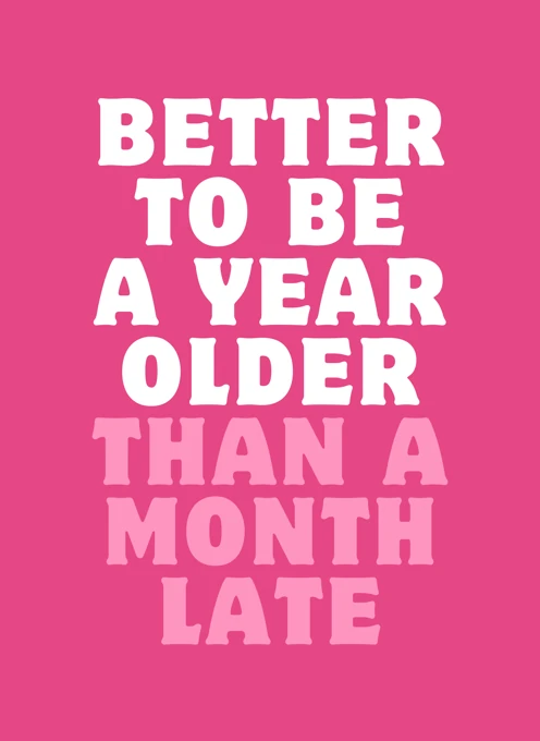
This vibrant design features bold, stacked lettering set against a saturated pink background. The typographic layout reads "BETTER TO BE A YEAR OLDER THAN A MONTH LATE," with the top lines in high-contrast white and the lower lines picked out in a softer pink to create a playful, rhythmic composition. The chunky, centred typeface makes the message immediately clear and highly readable from a distance.
The tone is witty and light-hearted, offering a friendly nudge for anyone who's late to the party. It's an engaging, contemporary typographic piece that works well for belated birthday wishes to friends, family or colleagues who appreciate a humorous take on timing. The overall simplicity and confident use of colour give this design broad appeal and a cheerful personality.
Comparison price excludes free shipping to the US, UK, Canada, Australia and most of Europe.
Price includes
- Free postage within Australia, Canada, the UK, US & most of Europe.
- A real stamp affixed to a beautiful kraft envelope.
- The recipient's address written in the same style as the writing in your card.
Card Details
- Card size: 125 x 175mm / 5 x 7″
- Printed on environmentally friendly 320gsm, uncoated card stock.
- Stock may vary by region and availability.
About the Artist
Sundiva Designs
Diva
Funny, bold and relatable cards inspired by pop culture and real life. Created to make people laugh and feel seen - bringing joy to everyone!